Sunday, March 20, 2016

Atlanta Tableau Users Group ATUG - Viz Challenge Data (March 17, 2016)

Yet another fantastic ATUG meeting on Thursday, March 17, 2016! Many thanks to the fine folks at HA&W for hosting our event.

Thank you Andy Piper, John Hoover, and Karen Purcell for making the meeting a success. Last but certainly not least... Nelson Davis for inspiring me. Your sorted-bubbles-on-maps... simply brilliant!

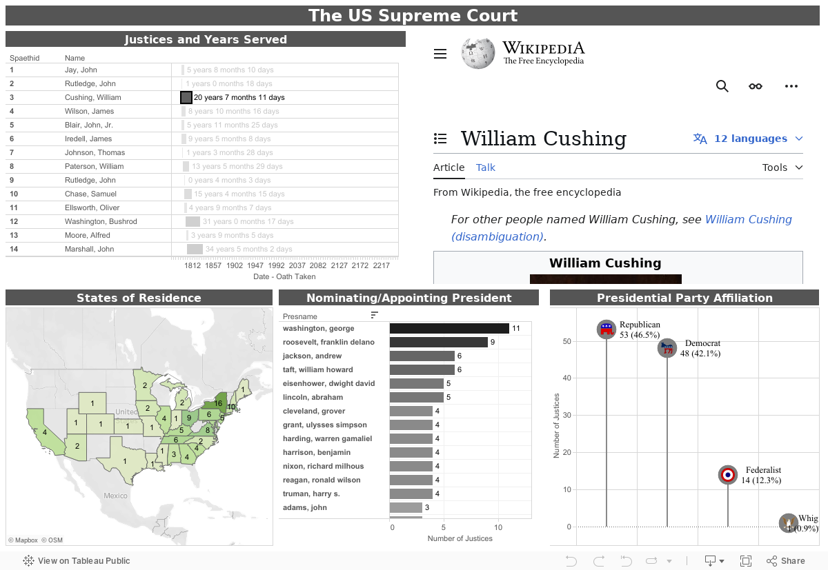
As promised, below is a dashboard I created using the Supreme Court data set. You can download the original data here. The dashboard is still in need of refinement. However, the 2 items of interest from the group were:

1. How to achieve URL Action Filters.
2. How to calculate Year, Month, and Day between any 2 dates.

The URL action filter is fairly straight forward. I just created a calculated field:

"https://en.wikipedia.org/wiki/" +
REPLACE([Name (First)], " ", "_") + "_" + REPLACE([Name (Last)], " ", "_")

...and used it as a hyperlink.

I thought the calculation between two dates was going to be easy. Perhaps I should have started work on it earlier than 9:00PM on a Saturday evening. I still didn't have a very elegant solution by 1:30AM the next morning! My original solution had 3 different year, month, and day calculations. Finally, I came up with this calculation...

// ************************************************************************************************
// Format the difference between 2 dates into a string of ## years, ## months, ## days.
// ************************************************************************************************

IIF([End Date] > [Start Date],
STR(INT((DATEDIFF('month', [Start Date], [End Date]) + IIF(DAY([End Date]) >= DAY([Start Date]), 0, -1)) / 12)) +
" years " +
STR(INT((DATEDIFF('month', [Start Date], [End Date]) + IIF(DAY([End Date]) >= DAY([Start Date]), 0, -1)) % 12)) +
" months " +
STR(DATEDIFF('day', DATEADD('month', INT(DATEDIFF('month', [Start Date], [End Date]) + IIF(DAY([End Date]) >= DAY([Start Date]), 0, -1)), [Start Date]), [End Date]))
,
"") +
" days"

Unless I'm missing something with my testing, this Tableau calculation should work for any 2 dates.


Thursday, March 19, 2015

Join ATUG for the Tableau's 9.0 Roadshow, Happy Hour, and Viz Contest!

Thursday March 19, 2015
W Atlanta Downtown
45 Ivan Allen Jr Blvd
Atlanta, GA 30308
404-582-5800

The 9.0 Launch Roadshow Agenda is as follows:

  • Registration and Refreshments (1:00pm – 1:30pm)
  • Keynote (1:30pm – 2:30pm)
  • Break (2:30 – 3:30)
  • Breakout Sessions /Hands on Learning
  • Hands on Learning Basic – For anyone new to Tableau
  • Hands on Learning - 9.0 Deep Dive – For current users to explore the new features
  • Tableau for Enterprise – For IT and executives
  • Happy Hour with appetizers (4:00pm – 5:00pm)
  • Atlanta Tableau User Group meeting (5:00pm – 7:00pm)

At the ATUG meeting from 5-7PM, we still plan to conduct a viz contest - please have 9.0 installed on your laptops when you come. You can access and download the dataset here. Arrive early to see the keynote, partake in the breakout sessions and enjoy happy hour, then stay for the ATUG meeting.

Thursday, August 15, 2013

Georgia Residential Rate Survey

Twice a year, the Georgia Public Service Commission conducts a survey of residential rates within the State of Georgia. All electric utility providers participate including the Electric Membership Corporations, the Municipal Electric Systems, and Georgia Power.

This visualization uses data obtained from the Georgia PSC website at www.psc.state.ga.us/electric/surveys/residentialrs.asp. Interactive actions have been included to assist with filtering.

Friday, May 31, 2013

Batman Villains

A visualization just for fun…

The 1966-68 Batman TV series was one of my favorite growing up. I ran to the TV twice a week in hopes that Catwoman (played by Julie Newmar) would be the villain! While still only a preteen, I didn't get the parodies and social commentary the show was making. Viewing it as an adult is much like viewing episodes of the Road Runner… there is an entirely different level of understanding to the dialog. While doing my research, I found it interesting that there were only 120 episodes. Far fewer than I remembered, but many more than the 79 episodes of my favorite series Star Trek.

This visualization uses data blending from 3 different datasets. Interactive actions have been created to assist users with filtering.

Sunday, May 19, 2013

Where are the banks failing?

Although not as prevalent, the FDIC continues to close banks. Below is data obtained from data.gov which provides a look at where banks are failing. Rank can be interactively changed to reflect total number per state or by per capita failures by population. Click on the state bar graph to filter both the map and detail sheets.

Monday, May 13, 2013

The Atlanta Tableau Users Group (ATUG)

One of my favorite times of the month is taking a half-day and going to the Atlanta Tableau Users Group meetings. Typically held at Norfolk Southern in Atlanta, the meetings are always informative and keep me motivated with my Tableau projects. If you haven't come to a meeting, I would most definitely encourage you to join us on the 3rd Thursday of each month. To learn more or to register (it's free), go to Tableau's community website at http://community.tableausoftware.com/groups/atlanta.


Thursday, May 9, 2013

U.S. Cancer Incident Rates

This visualization was inspired by the recent opening of the Cancer Treatment Centers of America in Newnan, Georgia. The dataset was obtained from the U.S. Department of Health and Human Services, the CDC, and the National Cancer Institute. Hovers and interactive filtering may be used to drill-down to granular information. The U.S. map is composed of 3 separate worksheets which display Alaska, Hawaii, and the continental US. Combining 3 worksheets using Tableau 8’s new floating object type mitigates the entire North American Continent from being displayed.